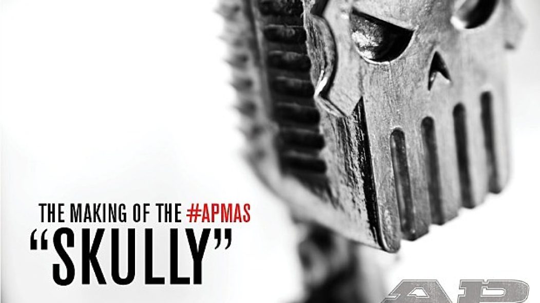
Anatomy Of A Skully—the story behind the APMAs trophy
Can you believe the APMAs were a month ago? We're just now starting to recover over in the AP bungalow, after posting what amounted to something like 17 days' worth of video content. But one question we've been asked a whole bunch, by fans and music industry-types alike, is, “What's the deal with Skully?” Skully, for those who don't know, is the name we gave our APMAs trophy that was presented to all of our winners, from our Icon, Vanguard and Guitar Legend recipients Joan Jett, Slash and Billy Corgan all the way down to Breakthrough Band winners Crown The Empire.
Despite his incredibly busy schedule (he is responsible for designing our magazine too, y'know), we manager to get a few minutes of our art director Christopher Benton's time to discuss the genesis of Skully, and he in turn bent the ear of APMAs illustrator Jason Goad as well as Rich Sandomeno at Spragwerks, who was responsible for turning this crazy idea into a real-life, three-dimensional statue. Enjoy this behind-the-scenes look at how an award show creates its trophy, and expect to see more Skullys at the second annual APMAs!

Let me start by saying that after 20-plus years of designing and directing at AP, it just so happens we have designed next to nothing three-dimensonal. The closest we would get would be, say, a pop-up tent design for Vans Warped Tour or a magazine display. So designing an actual award for the APMAs was an exciting yet daunting task. When a project is new to you, it often takes you into one of the best parts of designing: collaborating with like-minded creative people.
The direction for the award was solidified at one of the earliest APMA meetings this past October. Founder Mike Shea had this ironic, corny, spike Mohawked skull in his office. At some point during the meeting, our newly hired producer Josh Bernstein picked it up and said, “Even this would be kind of cool for the award.” I thought it was an awful skull, but I thought it was a good start. For many art and identity pieces we do at AP, we often like to start with a recognized symbol (a skull, an angel, a punk, a guitar) and then see what different directions we can take it.
I always try to alter the piece to break away from the clichés these symbols are associated with. I think Bernstein's recent relationship with the very metal Golden Gods Awards may have intensified this for me, but my overall motivation was, “How can we take the idea of a skull award and do something different and cooler with it to avoid metal or punk clichés?” And oddl,y maybe, make it more fun, too.
After those early meetings, I did these quick sketches of ideas for both the award and the logo. I started exploring a sort of cyborg vibe. My motivation was, “How do I make a skull mean ‘music?’” I loved the idea that this was for bands, and I wanted the award to somehow be, or include, a tool, or tools, of their trade. I kept falling back to microphones and speakers, which were the obvious entry and exit points for any band's music. I was also obsessed with it having similar dimensions to a microphone so it could be held like one.

Then, like most visual elements that launch out of the AP art room, the next phase started with a ridiculous brainstorming session, which I love. I can't describe the tangents we get on in these quick idea sessions, but whatever we come up with is the root or heart of the piece, even if you'd maybe never know it by the final product. This session yielded a mood board full of the classic movie Metropolis, robot chicks, deconstructed sculptures, polygonal styles, aliens, plenty of H.G. Giger skulls and old-timey microphones, which would help shape the look and feel of the award and the award artwork in general.
Now with these rough sketches and ideas, I thought it was smart to enlist the help of an illustrator to really develop this and help give it some life. I had worked with Jason Goad on illustrations for the Warped Tour program and designs for the 2011 AP Fall Tour. For the identity, we ended up with a hot cyborg chick we named Decibelle. Goad and I always could really get each other going creatively and collaborate well. I also knew Jason did some stuff for Anarchy eyewear and Hot Wheels, and he told me about having to do all-around sketches for these products, which I figured would come in handy when presenting to a sculpture. He seemed like the guy, and I knew from working with him in the past that this was way up his alley!
I was already in talks With Rich Sandomeno at Spragwerks in LA. He had done the Golden God award, and Bernstein couldn’t recommend him highly enough. After checking Spragwerks out (which is just Rich himself), I found that all his work, from his jewelry to metal art pieces, was just rock-n-raw! I knew it would be perfect for whatever we would come up with, and so once Jason had his sketches and turnarounds, we were both excited to see where he’d take it into the third dimension!
— Christopher Benton, AP creative director
JASON GOAD, Illustrator • ingoadwetrust.com
When Chris gave me the sketches and mood boards,at first I had this pre-conceived idea of what an award should look like, and because the skull concept pitched wasn't along those lines, I was having difficulty getting hooked in the beginning. But I like a challenge and sometimes that means working outside of your comfort zone and your own sensibilities.
I set out to draw my interpretation of the direction I was given. It should be noted that considering this was an alternative music awards it made sense that the award shouldn’t look similar to other awards. My first versions from February were extremely literal and pretty close to how the final award ended up turning out, but as happens sometimes when you are designing, because it's not “there” you mistakenly think maybe it's all wrong and go on these crazy tangents and dead ends only to come right back to where you started.

One such tangent that actually worked out in the end in a different way happened during one of our brainstorming sessions when I mentioned that one of my Valkyrie characters would make a great award/sculpture. So after I got off the phone, I did a couple sketches just to help people visualize what was in my head. The Valkyrie was well-received, although it was pointed out that it would end up looking similar to an Emmy, especially being metal-plated.
But even though “Val,” as I was calling her, didn't make it as the final award design, it worked out because she was utilized in a lot of different ways, including the huge stage backdrops, T-shirts and posters. To me, Val was a rocked-out version of a classic opera singer wearing a Valkyrie outfit. It's kind of cool because, even typing at my computer, I can look at my art desk right now and see my original ink drawing of her and am still amazed that she ended up as a huge visual element behind some great musicians like Ice-T and Billy Corgan.
From there, we considered developing the idea of going with a biomechanical look. Coming from years of doing tattoo flash, I was familiar with biomechanical art. Also being obsessed with Alien movies growing up, I was pretty well versed in H.R. Giger’s work, but as I started doing sketches in that direction, I kept falling into a Terminator-looking metal skull rut. (Also, at one point during one of Chris and I's chats, I had this image of a Devastator/Constructicon-like robot (from Transformers) composed of different musical instruments pop into my head—a “Band Bot” as we started referring to him.) It was fun to just get it out of my head and onto a piece of paper, but in the end, it was too far out-there and wouldn't read very well as a metallic-plated sculpture anyway. Stuff like this is what I love about the creative process and something that people never really see—all the different directions an initial idea can go through during the brainstorming portion.
After all these creative tangents and redirections, Mike Shea and Josh sort of and expressed that they thought we were pretty close with the first sketch way back in the beginning, so we set out to tweak that design and moved toward the final award design. [At this point, Mike was also motivated back to the skull idea because he loved the thought of calling it a Skully, a term he coined in a late-night e-mail to me. —Chris Benton]

After a few more changes, It was weird when Chris finally said, “I think we got it!” Honestly, I didn't believe him because it was very sudden, kind of like falling asleep on a long ride and someone waking you up with, “Okay, we're here.” Once we nailed down the design, I had to produce what are called “turnarounds.” Basically, you are showing an object from every angle and then handing that off to the sculptor to produce the final award, and even then things might still change based on the sculptors' sensibilities and what he knows will work as a real object. Every once and awhile, I would receive updates from Chris showing me pictures of the sculptor's progress, and it was great watching it go from a flat pencil drawing in my sketchbook to an actual 3-D object with shadows and dimension.

Skully keeps getting compared to the Punisher skull. How would you respond to that comparison?
I can totally see that, and growing up as a kid obsessed with comics, I can also see how something as iconic as the Punisher skull has managed to subliminally bore its way into my brain and by consequence, my art. As far as similarities, I think it's kind of like how there are different versions of the bat symbol, but any kind of graphic version of a bat is going to make people think of Batman. I ran into that problem working on a Dracula-themed vehicle for Hot Wheels a few years ago, when every bat silhouette I drew just ended up looking like a variation of the bat symbol. That's a testament to the greatness and purity of their symbols: No matter how much you change a simplified graphic version of a skull, it's going to always be compared to the Punisher skull. Them's the breaks, kid.