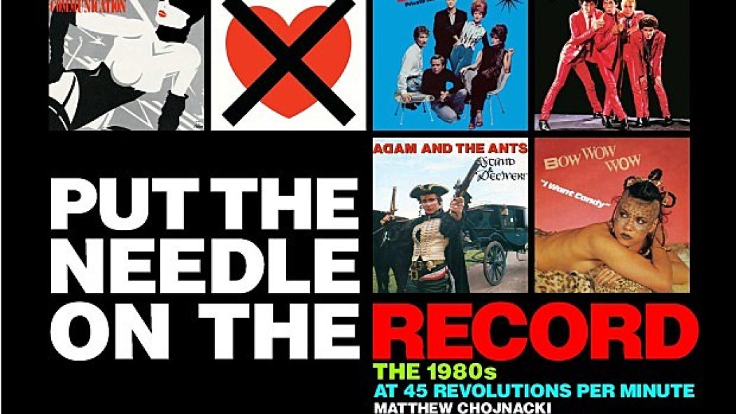
Put The Needle On The Record: A new book celebrates the stories behind vinyl sleeve art of the 1980s
Once upon a time in the distant past, record labels great and small would press up singles, two (sometimes more) songs on a seven-inch piece of vinyl. Many of these records had either plain white sleeves or stock ones printed with the label’s logo on them. But in many cases, a limited number of these records were issued in picture sleeves, giving them a collectable value. Those picture sleeves inspired MATTHEW CHOJNACKI to compile Put The Needle On The Record, a book of reprinted picture sleeves from the ’80s accompanied by commentary from photographers, graphic designers and the artists themselves.
Sandwiched between a foreword by Scissor Sisters’ Jake Shears and an afterword by Duran Duran keyboardist Nick Rhodes, the book explores the creativity of sleeve designers in a decade that had as much innovation as it did groan-inducing cheese. Chojnacki is quick to point out that his compendium of sleeve art doesn’t necessarily make the claim of “best songs of the ’80s” listicle-fodder. The Cleveland-based author is a fan of design as much as he is music, and he delves into the stories—and in some cases, the similarity of designs—with gusto.
JASON PETTIGREW chatted with Chojnacki about his enthusiasm for graphics, the hoops it took to research the pieces and how he feels the cover art of the 21st century stacks up in contrast.
Where are you coming from with this book? Does your interest in these images come from a pop culture fascination or an overarching fascination with design?
MATTHEW CHOJNACKI: I’m a very visual person. First and foremost, I like music. I have this huge collection of vinyl and over the years, I found myself not just listening to the music, but kind of flipping through the artwork, as well. I have about 5,000 singles not just from the ’80s, but from other decades, too. Over time, I moved all that music onto my iPod, but I still found myself holding onto the collection to look at the [cover art] and absorb the liner notes. For me, it was very much a complete experience—not just listening to the music.
So, about seven years ago, I started to think about what I wanted to do with my collection and I thought, “Wouldn’t it be cool if there were a book out there that could replace all these covers?” I realized there are a ton of cover art books out there, but mainly just for LPs. At that time, I think there was just one book ever written on singles sleeves. I’m not a writer by nature; I’m an accountant. For this, it was very much a similar kind of exercise of organizing the images and going through the routine of finding the story. For me, it was kind of a technical book to put together. In retrospect, the ’80s are made fun of— [what with] VH1’s I Love The ’80s and all of these shows that poke fun [at that decade]. For me, I think the artwork for vinyl sleeves—especially with the mainstream culture and with big labels—has disappeared. As the images shrink smaller, the whole movement is kind of dying, except for indie acts who are still putting a lot of effort into their sleeves. I thought on one hand, it would be fun to kind of recollect and kind of reminisce. But on the other hand, there were a lot of great sleeves in that decade. Wouldn’t it be great to get back to [appreciating] that a little bit?
The advent of digital music downloads has helped foster a mindset that denigrates cover art. The attitude is, “I have a downloaded track. What do I need a sleeve for?”
I love my digital music; anything I buy I also digitalize, so I can take it with me. But I think part of the experience is almost lost for new music fans. It used to be with the advent of videos, you really absorbed the music. It was not just about listening, but it was about experiencing: You had to see it live, you had to see it on video, you had to listen to it. It knocked all of your senses. For most music fans today, it’s just about listening to music on the go. There is less of that experience at play. I go to a lot of shows and the crowds are getting thinner. It’s not just because of the ticket prices, but I think people just think about music in a different way now with YouTube and all that. It’s very much like, “Let’s absorb it really fast and then throw that artist away and move onto the next.”

The first record I bought solely because I loved the cover art was the British 12-inch single of “Here Comes Your Man” by Pixies, which has a profile photo of a bull terrier. Did you ever buy a record simply because you loved the album art?
Grace Jones is in that category for me. Visually, she’s just unbelievably stunning. Even now, you can look back at those sleeves from 20 years ago and they’re still relevant and kind of punch you in the face. There are a lot of cool British sleeves from the ’80s—and even ’90s—where they had these cool fold-outs and limited-edition covers with foil. I would buy a lot of those and listen to them once and then just put them in sleeves. A lot of times, I would spend quite a bit on these bright packages because it was a great visual, but it doesn’t mean necessarily that the music inside was awesome.
That’s what a lot my book is about. This isn’t about the best singles of the ’80s; it’s kind of a visual journey through that decade. A lot of it is really good, but there is definitely some cheese in there too. That’s what the decade was about.
How difficult was it to put the book together?
With the internet, it’s easier to find people, but that doesn’t mean they will jump onboard a project. Usually, the cover artists were very excited about jumping onboard because for a lot of these artists, even though their piece was plastered all over millions of LPs, [they] have the same exact story: They were paid like $100 or $200 and then suddenly their image is on a million T-shirts. Then their style is copied. They are really proud of the artwork and they love that it’s getting attention. They love to tell their story and often, it is for the first time. I found [it] unbelievable that no one has approached them and asked, “Hey, was that really David Lee Roth as a kid on the cover of Van Halen’s 1984, or was that him just faking the story?” There are all these great stories that are out there and usually the actual cover artist is more than happy [to share them].
To be honest, I thought I would get apprehension from the artists themselves, because you’re commenting on their work. I thought maybe they wouldn’t be interested. I would say 95 percent jumped on board. The musicians were a little bit harder to corral in. Some absolutely did not want to go back to the ’80s—they looked poorly on it. Most people were more than happy to give me a few minutes. In general, hip-hop artists and metal artists were a little trickier to grab. It’s definitely a pop-culture project and it puts them in the same book with some fluffy pop music, so some of them were a little apprehensive, but I did grab as many as I could, like Scott Ian from Anthrax and a lot of hip hop artists who didn’t mind.
Point blank: Do you think that compared to back then, design in the 21st century is either really cool, really bad or just different?
It depends on the genre. To be honest with you, I think the artwork issued by mainstream labels is really bad. It’s up to the artists themselves to push for good artwork; they can do that if they have enough clout. I find it sad when they release a single on iTunes and they think, “Well it’s one-inch by one-inch, let’s just Photoshop something together.” I think that’s just really lazy. Now on the flip side, if you go to the alternative rock, hard rock or indie music categories, I find that a lot of those artists still really care about making an experience for the listener. If you talk to a lot of these artists that are self-releasing albums now, that seems like the direction of the music industry now. They are really putting out a good product. I think now that anyone can release an album, write a book, make a video and be a star, it’s just about making the coolest product possible. I think that’s where the mainstream labels are kind of lost.
Music is the soundtrack to an individual’s mythology, and it’s a great vessel to contain and trigger memories. How do you want Put The Needle On The Record to be perceived? Purely on a design basis on what was happening then? Or do you want to avoid strolling down Memory Lane?
I want it to do kind of both. For somebody who really enjoyed music in the ’80s and [grew up] in that decade, there’s a little bit of a reminiscing aspect to that. But I really made it a point to not just go for the easy sell, which is to put in the most popular sleeves from the ’80s. I could have gone that route and almost every cover art book is “The Best Of.” I wanted to kind of reflect on the times, but I also wanted to reflect on how daring it could be. Even more daring in some cases—like that sleeve for The The’s “Infected”—it was daring then and it’s daring now. So people were pushing boundaries in ways that I think sometimes are not pushed anymore. With that in mind, there is some reminiscing, but at the same time, I wanted to show the reader that, “Hey, 30 years ago, there was a lot of boundary-pushing going on. There is no reason why we can’t apply this to now.” alt